 Issue No. 82
Happy 250th: Five Dispatches From Everywhere Else
Naturalized in Brooklyn, looking everywhere but here for once
Read this issue →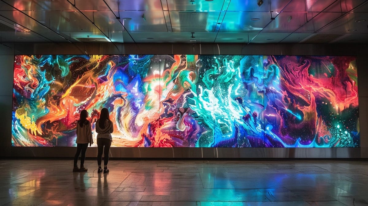
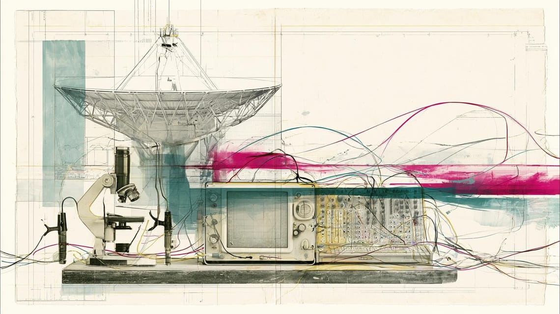
Every generation of artists quietly steals the tools that were never built for art.
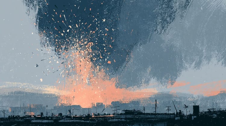
A weather satellite 22,000 miles up has one job: watch storms so we get some warning before they hit. Nobody who built it was thinking about art. Then Seán Doran took 2,500 of its infrared images, patched the gaps by hand, added color, and slowed it down until the clouds looked like moving paint. A…
Read this issue →
Issue No. 82
Naturalized in Brooklyn, looking everywhere but here for once
Read this issue → Issue No. 81
What if the hardest thing to generate turns out to be belief?
Read this issue → Issue No. 80
When everything is technically correct and tonally identical, who's left to tell you what matters?
Read this issue →